
Code Championship

INTRODUCTION
CLIENT: Code Championship is a gamified coding platform that empowers children, grades 3-9, to compete in bot building tournaments. Its founder is a software developer who loves getting kids excited about code. Their events turn coding into a fun and competitive experience.
OBJECTIVE: Code Championship is looking to improve the ease of creating your first bot on the platform. Essentially, how do we simplify the experience so children can understand it and have a fun positive experience.
METHODS: Cognitive walkthroughs, contextual inquiry, user research, journey mapping, affinity diagraming, architectural diagram, hand sketches (low fidelity), interactive prototype (high fidelity)
TOOLS: Google Sheets, Miro, Sketch, Craft, InVision
ROLE: UX Researcher/UX Designer
TEAM: Liz Brodd, Sam Jorgensen, Mackenzie Leach, Cristhian Arias-Romero
RESULTS: INTERACTIVE PROTOTYPE TOUR VIDEO
After my team and I collaborated on usability testing and secondary research, I created an interactive prototype tour that shows all of the improvements to the platform to help students play with ease.
In my research observations I noticed participants were skipping over the instructions trying to get to the game as fast as possible. This lead to participants not understanding how the block chains are set up, what they do, where to build bots, and the overall objective of the game.

JOURNEY
COGNITIVE WALKTHROUGH
We began by individually conducting cognitive walkthroughs to understand what users were experiencing the first time they visited the site. We were specifically looking at:
Mental Model Matching
Visibility/ Hierarchy
Mapping/Consistency
Feedback.
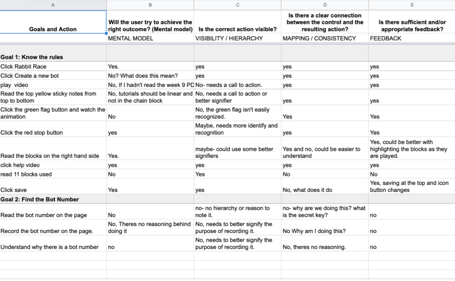
We found that many tasks didn’t meet existing mental models around how users play games, which lead to the game being hard to understand. Unless you watched the video on the homepage explaining how the game is played, you were going to have a hard time understanding it.
The visibility of the blocks were also a point of friction, as they are all stacked on top of each other and don’t offer any sense of hierarchy. What does each block do? How do I move them? Why are they shaped like that?
Additionally, users didn’t know where and how to start the game, which should be the easiest component to grasp about a game.
AFFINITY DIAGRAMING
After completing our individual Cognitive Walkthrough, our team worked together to compile our data into an affinity diagram to identify potential pain points, project goals, questions, and tasks for a contextual interview. These were the main goals we identified:
Understanding the rules
Programming a bot
Understanding what a bot number is
Saving code
Win
This affinity diagramming allowed us to easily write a cohesive script for a contextual inquiry interview.

CONTEXTUAL INQUIRY
After our research was done and we had a sense of the things we were looking for, we hopped on a 45 minute Zoom call with a local 4th grader. We asked her if she understood the rules, knew how to play, program a bot, if she knew what the bot numbers meant, and how to save code. We did this to reveal possible pain points and if our finding matched up with the participants.

During this session I took notes and observed her mood. We developed a visual scale of emojis so that she could better express how she was feeling during any given task. I could tell she couldn’t grasp what was going on, due to the fact that she blew right over the instructions.
Ignored current informational boxes - “Why are these boxes here?”
Additionally, she didn’t know how to start the game, missed green flag entirely
Couldn’t save her work.
She was a good sport and eventually went back to watch the video. Thats when things started to click for her. She was very enthusiastic and wanted to share it with her friends.
“When someone answers my questions, I feel smarter”

RESEARCH FINDINGS, ARCHITECTURE DIAGRAM, & PROTOTYPE PLANNING
From the observations and findings from our contextual inquiry, key opportunity areas were identified and some user stories were created to add rationale to the changes that were made to the Code Championship website.
Along with these stories and key opportunities, an architecture diagram was made to map out key changes within the website and what pages needed to be added.
USER STORIES
As a young person I want the controls of the game to be easier to understand and easier to navigate so that I can focus on playing the game and not learning the game.
Opportunity Area:
Overall website navigation
Have clear call to actions (START vs. green flag) ←
As a young person, I want a game that has more accessible command buttons so I can understand the control system in a way that makes sense to me .
Opportunity Area:
Reorganize command buttons so they are more easily accessible
Have icons to speed up time of recognition
As a young person who is a new user I want more guidance and hand holding until I feel comfortable enough to play alone.
Opportunity Area:
Make the introduction video on Play Now page bigger and add CTA
Once in arena page, do a “page tour” explaining in simple directions that you can click your way through to have a better sense of page.

LOWFI PROTOTYPES
I made some hand sketched prototypes with annotations of specific features and functions. This prototype highlights a better onboarding process, playing with a friend, high scores, traditional game feature set, a start button, gameboard section titles and reorganized code pieces.

RECOMMENDATIONS

The user was not engaging with the instructional video on this page, so we moved it to the home page (which leads to the “play now” page) so it could be more prominent and immediately useful for the user to understand the rules.
We rearranged and enlarged the layout so the user could easily get to the game quicker. We also incorporated Code Championship’s typeface to create more consistency with their branding.

Once the user has selected a game, we move to the naming of Player 1 (P1) This gives users their first opportunity at customization, which the previous version was lacking. Additionally, the user was unclear as to who they were playing. This is also where the “PLAY WITH A FRIEND” option was added so that if the user wanted to play against a pal, they could send them a direct link to this page and they would automatically be connected to the same game.

The original design had a an onboarding path that users were not reading and quickly “X”ing out of.
In my redesign, I added visual contrast between the information box and graying out the backdrop so users would have to take the time to read the instructions, or at the very least add the friction of skipping through them all before arriving at the game play page.

The block menu in the original version is not immediately clear as to what the blocks do or their hierarchy.
In my redesign all of the blocks are broken up into separate tabs to add distinction between blocks. Also arrows were added for users to have a visual clue of what the blocks do. I continued the branding by using a gradient of Code Championship’s blue.

The game page had several things that were missing and was in need of “gamification”
For starters it had no clear start game button. In the redesign I added a big button with the words “START GAME” to match gaming mental models. Additionally, a “game bar” was added with a stop, and pause button. In the original webpage player 1 and 2 were at the top of the screen taking up valuable space and making it hard for users to see what was happening behind there during the game. I brought it down to maximize game space.
A timer was also added. High scores, play with a friend, bot#, secret key were also simplified and hierarchy was added for user clarity.
CLIENT FEEDBACK
“Wow... this is incredible. As always, there are great ideas that would be really challenging to implement, but I feel like the biggest “wow” moments for me are the, “This is so obvious, how come I didn’t think of that!” The share with a friend link is so great and is something that won’t be too hard to implement. And adding the name before they ever get to building the bot is genius! That’s going to clear up so much confusion! That’s fantastic! Thank you so much!”
- Luke Schlagen, Code Championship Founder